

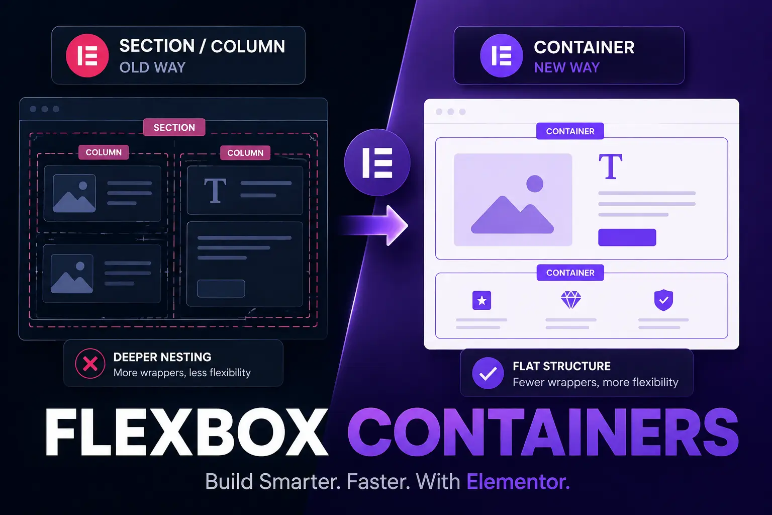
Elementor Flexbox Containers have quietly become the biggest structural shift in Elementor since the page builder first launched. If you’re still building with the old Section > Column > Widget structure, you’re not just working the “old” way you’re shipping heavier, slower pages than you need to. In this guide, we’ll unpack what containers actually are, why Elementor is pushing every builder toward them, and how to start using them properly in your next project.
What Are Elementor Flexbox Containers?
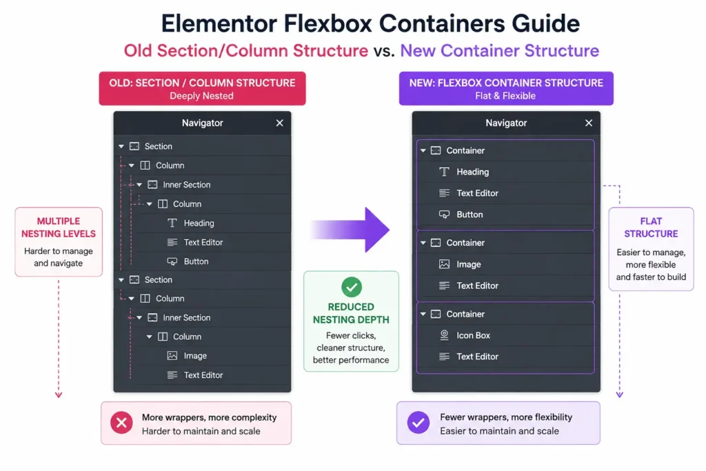
Elementor Flexbox Containers are a single, unified layout element that replaces the old Section and Column system. Instead of nesting a Section inside a Column inside another Section, a Container can hold widgets, other containers, or both all controlled through CSS Flexbox (and now Grid) properties like direction, wrap, gap, and justify content.
The practical result: fewer wrapping <div> elements in your page’s HTML, which means a lighter DOM, faster paint times, and layouts that are genuinely easier to reason about once you’re used to the mental model.
Why Switch From Sections and Columns to Containers
Three reasons agencies and freelancers are migrating in 2026:
- Performance: Fewer nested divs means less HTML for the browser to parse, which directly helps Core Web Vitals especially Cumulative Layout Shift and Largest Contentful Paint.
- Flexibility: Flexbox properties (direction, wrap, align, justify) give you far more control over responsive behavior than the old column width percentage system ever did.
- Future-proofing: Elementor has confirmed containers are the long-term replacement for sections. Templates and kits built on the old system will eventually need migration, so starting fresh with containers now saves rework later.
Step-by-Step: Building Your First Container Layout
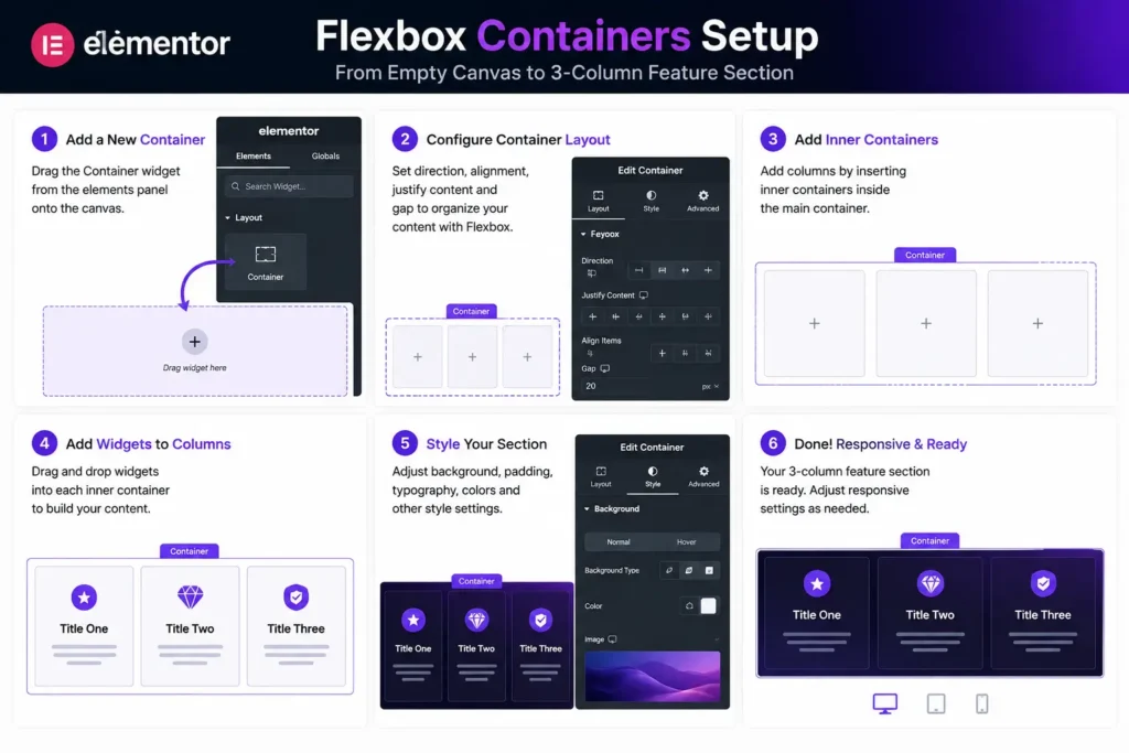
- Enable Containers. In newer Elementor versions this is on by default; on older installs, go to Elementor > Settings > Features and toggle Container on.
- Add a Container to the canvas. This becomes your outer wrapper think of it as your old Section.
- Set the direction. Choose Row for horizontal layouts (like a 3-column feature grid) or Column for stacked, vertical layouts.
- Nest a child Container. Drop a Container inside your Container to create column-like groupings without leaving the Container system.
- Adjust gap, padding, and alignment. These replace the old column gap and vertical alignment settings, but now apply consistently across breakpoints.
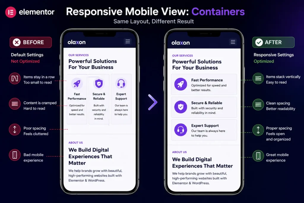
- Set responsive behavior per device. Switch direction from Row to Column on tablet/mobile breakpoints so your layout stacks cleanly.
Elementor Flexbox Containers vs CSS Grid
Elementor now supports both Flexbox and Grid display modes inside the same Container element. As a rule of thumb:
- Use Flexbox for one-dimensional layouts a row of cards, a navigation bar, a stacked hero section.
- Use Grid for two-dimensional layouts a photo gallery, a pricing table, or any layout where items need to align on both rows and columns simultaneously.
Both modes live under the same Container, so you can switch a section from Flex to Grid without rebuilding it from scratch a huge time-saver compared to the old system, where changing structure often meant starting over.
Best Practices for Performance With Elementor Flexbox Containers
- Avoid over-nesting. Containers are lighter than sections, but nesting five containers inside each other still adds unnecessary markup. Flatten where you can.
- Use a global container template. Set your default padding, max-width, and gap once in Elementor’s Theme Builder so every new container inherits sane defaults.
- Combine with Elementor’s native lazy loading for image-heavy sections built inside containers, especially galleries and portfolio grids.
- Audit old templates before migrating them wholesale. Some third-party widgets and older Elementor Pro kits still expect the Section/Column structure and can break visually inside containers.
Common Mistakes to Avoid
- Mixing Sections and Containers on the same page without a clear reason it’s supported, but it complicates maintenance for anyone who edits the page later.
- Forgetting to set a max width on your outer container, which can cause full width layouts to stretch awkwardly on ultra wide monitors.
- Skipping responsive testing Flexbox direction and wrap settings behave differently across breakpoints than the old column percentage system did, so what looks right on desktop can collapse oddly on mobile if you don’t check each device view.
Final Thoughts
Elementor Flexbox Containers aren’t just a nicer editing experience they’re a real performance and maintainability upgrade for anyone building WordPress sites professionally. If you’re still relying on Sections and Columns out of habit, the container system is worth the short learning curve, especially as Elementor continues to phase out the old structure in future updates.
If you want a head start, Olaxon Web Studio’s Elementor Pro template kits are already built container-first, so you can skip the migration work entirely and build on a modern foundation from day one.